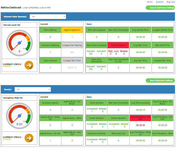
...
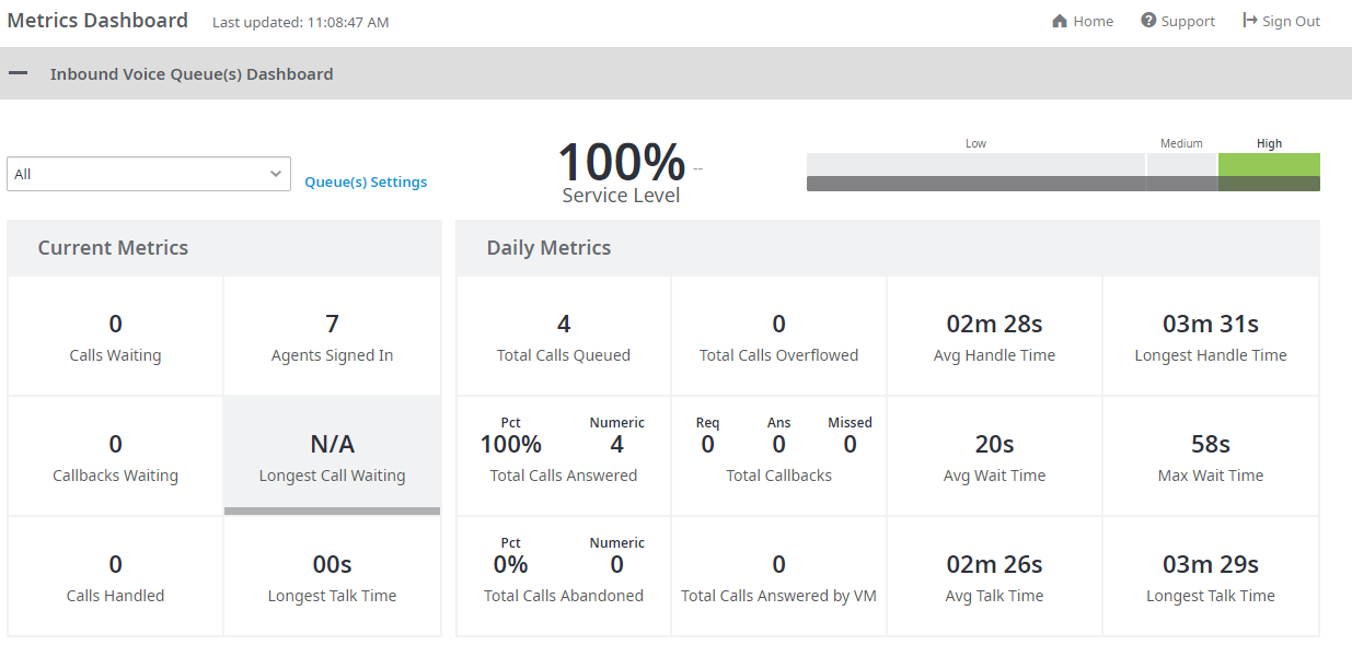
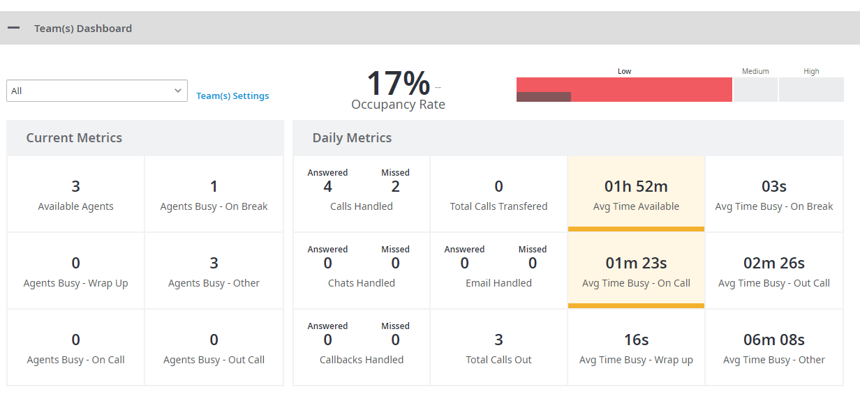
The background color of each numeric infographic is a representation of the set thresholds. Thresholds and alerts can be applied to both dashboard views. The color for each numeric infographic displays Green, Amber, or Red depending on the threshold settings. White indicates the threshold is out of range of the settings in place and/or higher than the highest default setting.